
A new image for a vibrant town center
The Brief
Weilheim Business Development commissioned the Bachmann brothers to create a consistent visual and editorial identity for Einkaufsstadt Weilheim (Shopping Town Weilheim). The goal was to reposition shopping in the town center as an emotional, cultural, and communal experience.
The Design
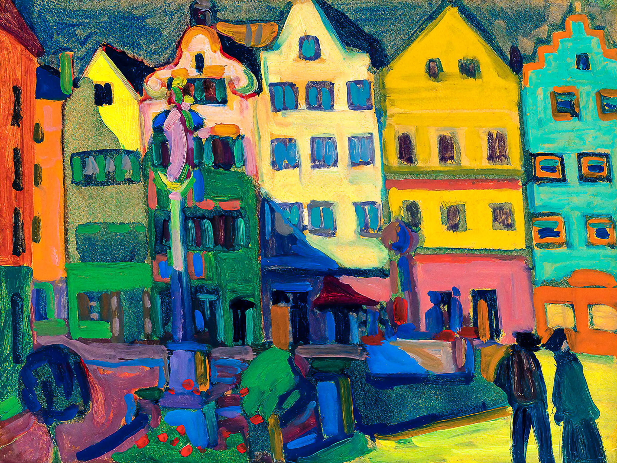
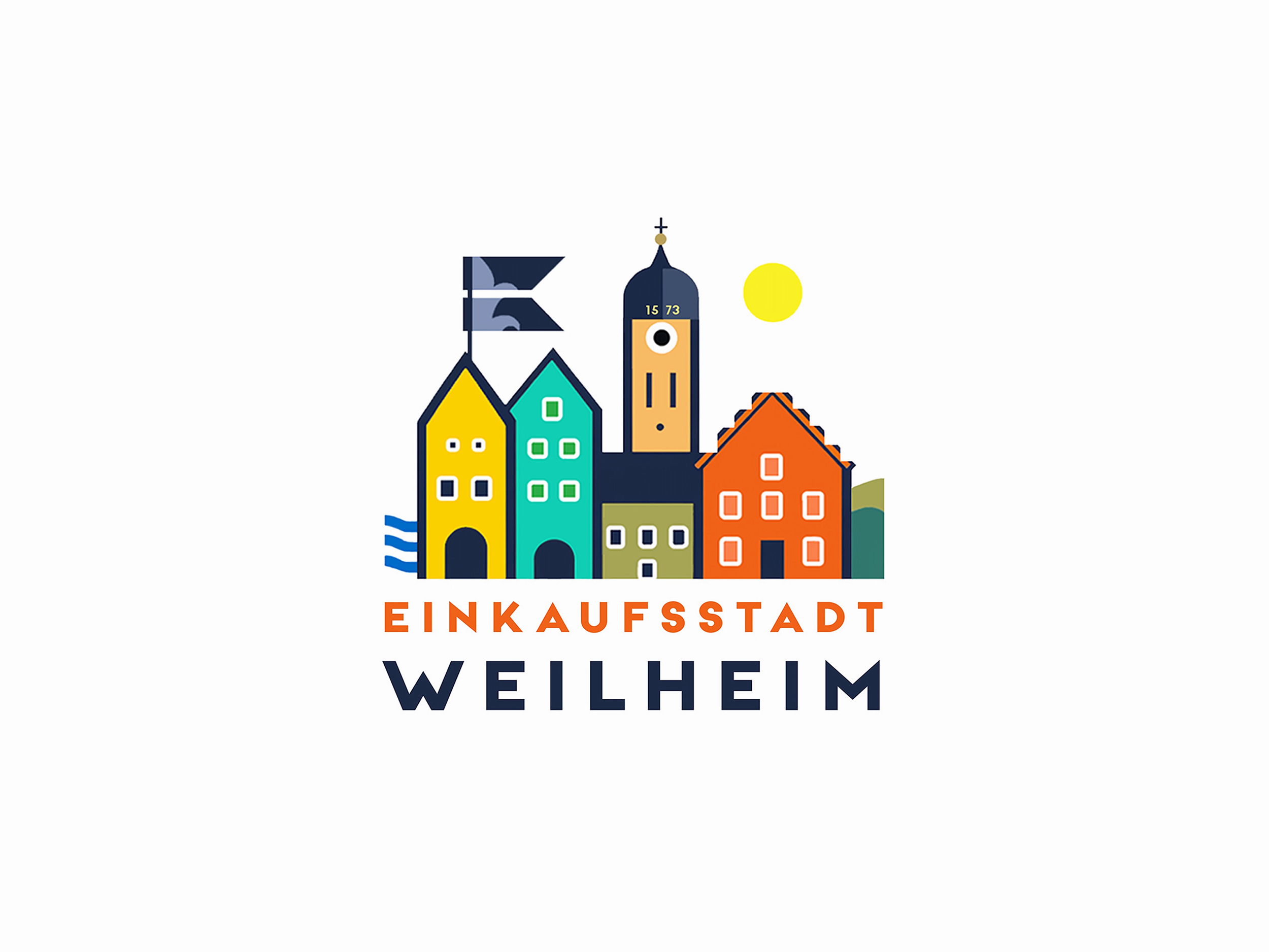
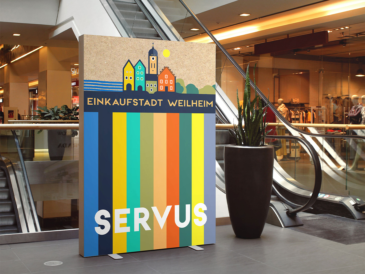
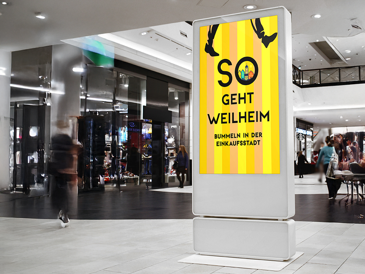
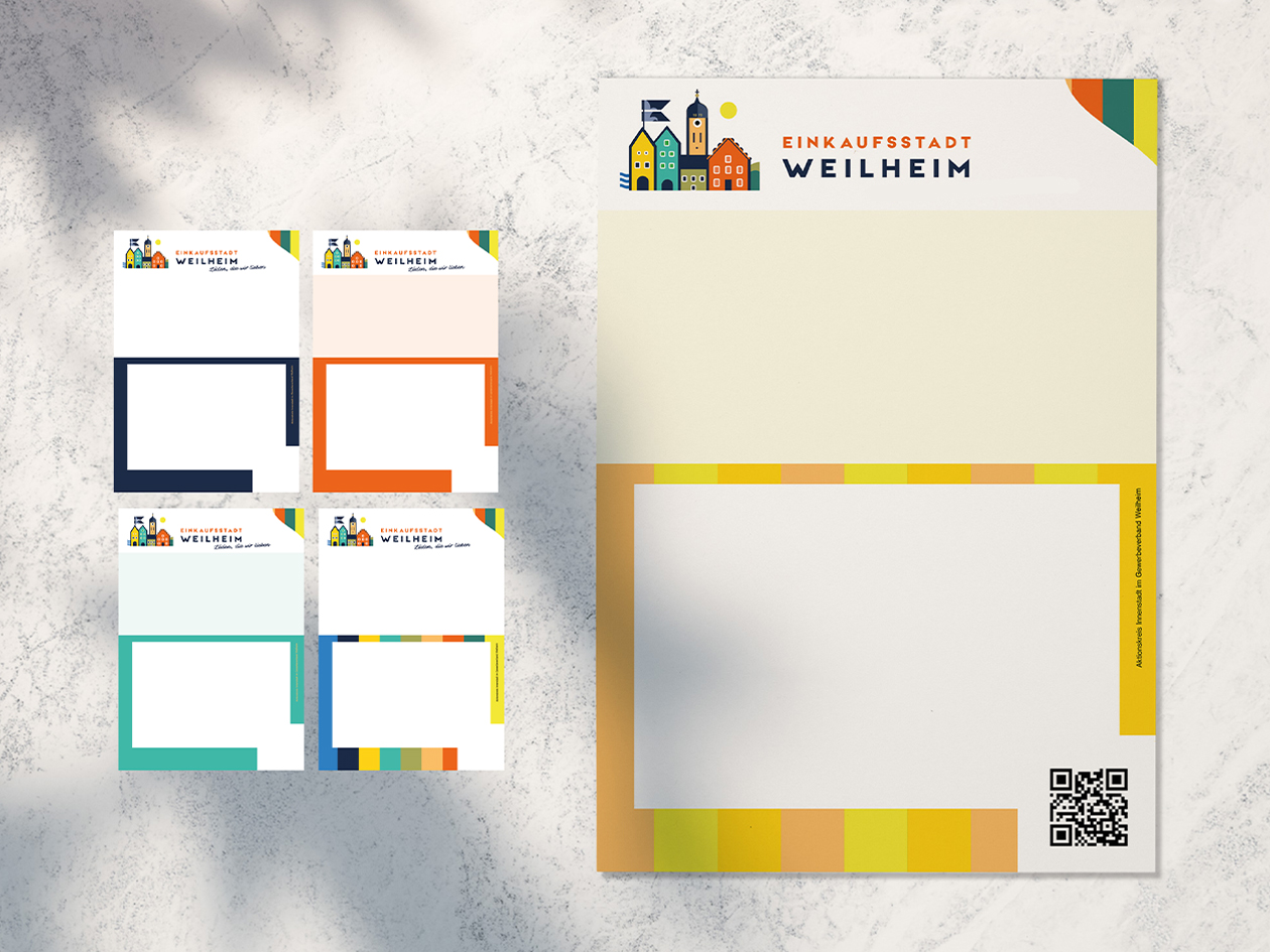
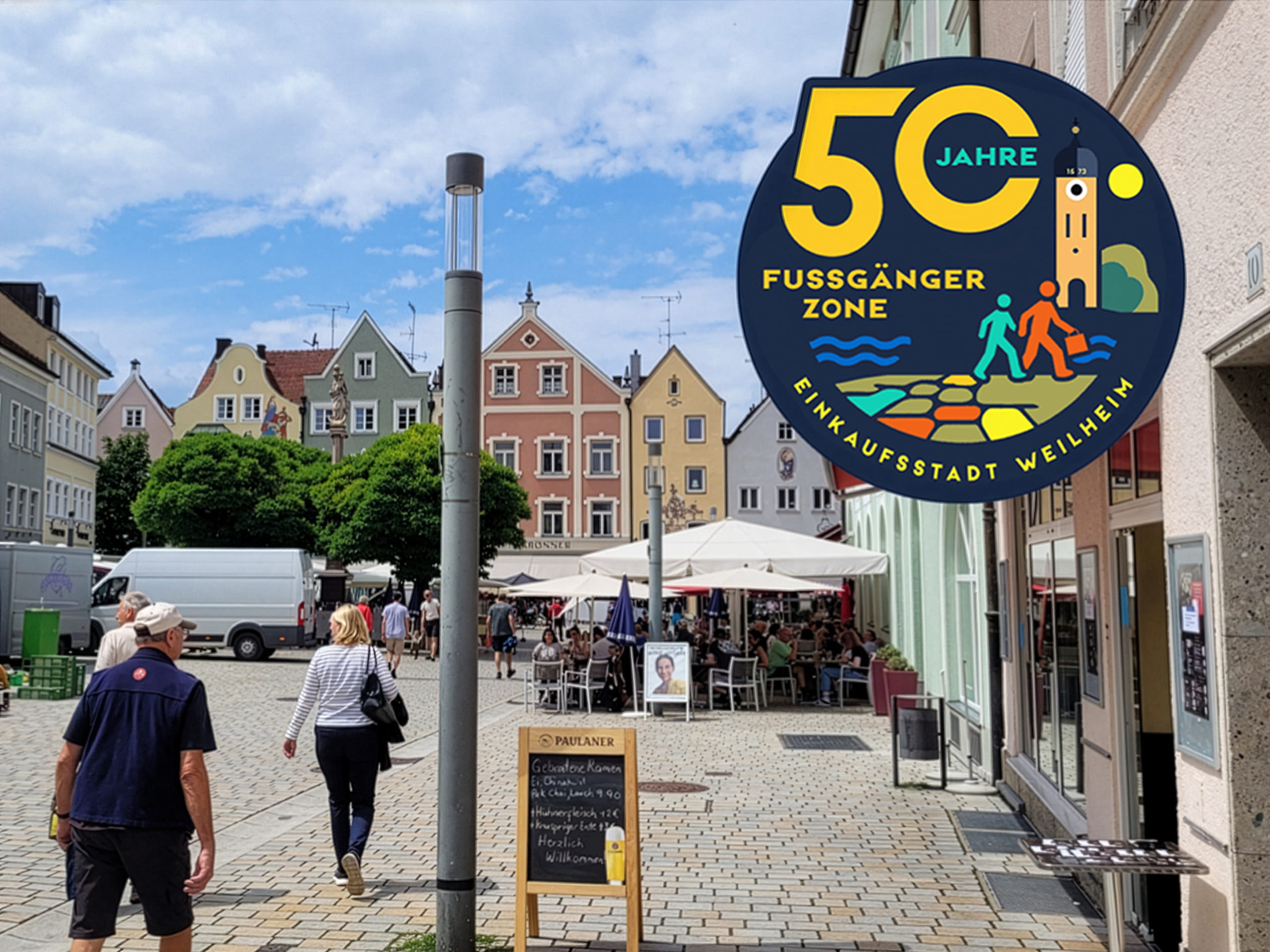
The color palette is inspired by a special treasure: Kandinsky’s oil painting of Weilheim from the early 20th century. We extracted its primary colors and reinterpreted them as a color palette, as logo colors, and as dynamic color stripes that reappear on posters, at markets and events, on social media, and in print.
The Context
With Einkaufsstadt Weilheim, we created a system rooted in the town itself, not in fashion trends. Kandinsky’s sense of color becomes the visual DNA of the town center, and the claim becomes its emotional anchor: “Läden, die wir lieben!” (Shops we love!)
Jays: Branding • Event • Marketing • Design
