
Designed like the menu. Clear. Honest. Direct.

The Brief
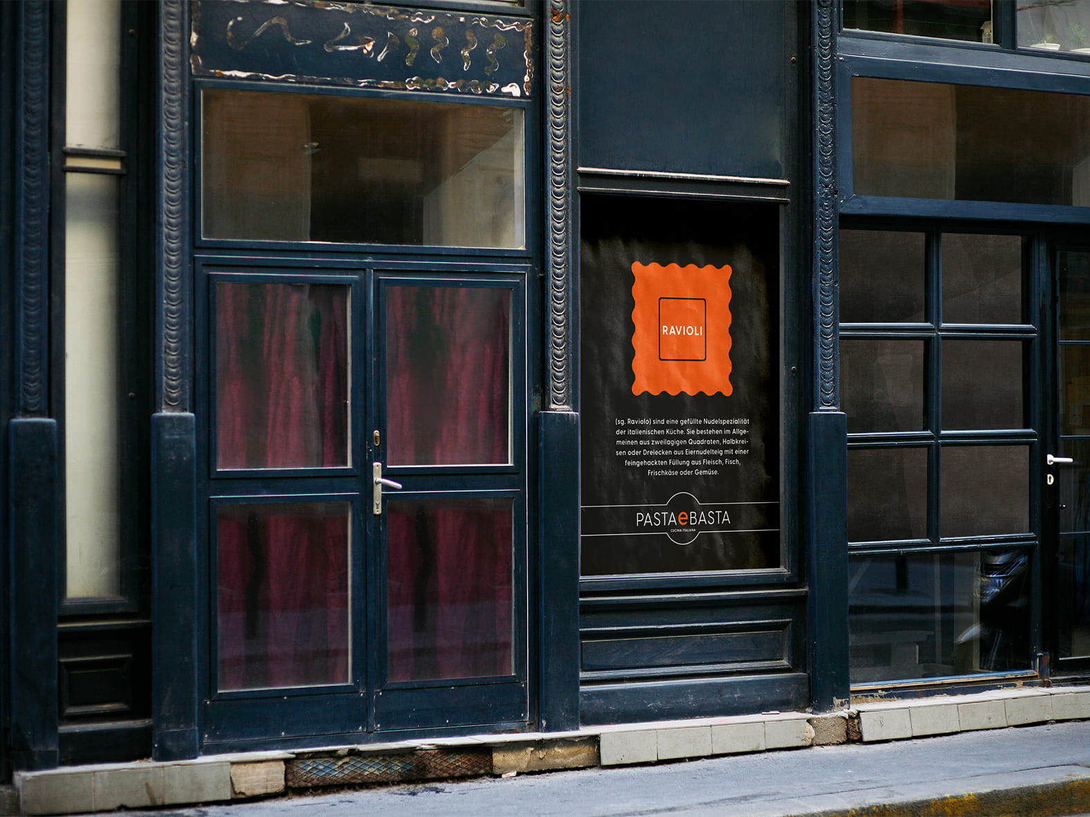
For Pasta e Basta, a restaurant in Munich, JAYS developed the complete visual identity. The restaurant’s concept was deliberately reduced: a few dishes, honest ingredients, and a clear focus on pasta. This simplicity was to be reflected consistently in the design, from the logo to menus and printed matter to communication within the space.
The Design
The graphic language grew out of the shape of pasta itself. Lines, arcs, and cross sections of different pasta shapes became a reduced design system. Instead of Italian clichés, the result was a clear identity that made the simplicity of the concept visible.
The Context
The idea ran consistently through the entire identity. Just as the restaurant reduced its cooking to the essentials, the design focused on a few striking elements. The shape of the noodle became a recurring motif and gave Pasta e Basta a distinctive, unmistakable character for many years.


Jays: Branding • Marketing • Design
